Revisiting Scribos: urushi, Flow and le Stelle
We have history
Back on the old site, I reviewed quite a few Scribos. I have owned… seven now? Eight?
The appeal of Scribo pens is, to me at least, pretty obvious. They make nibs that feel and behave like nobody else’s, paired with bodies, materials and clips that are both distinct from other makers’, and share a family resemblance.
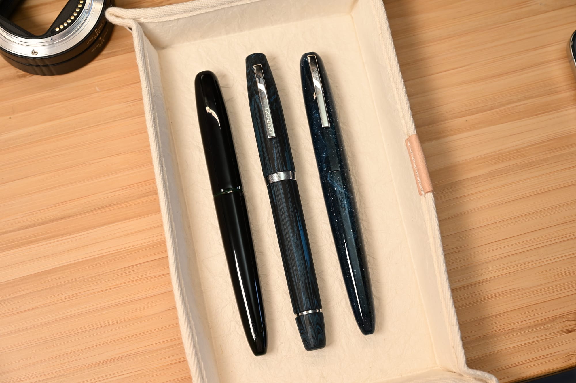
After some years without a Scribo in my collection, I fell back into the rabbit hole again with the impulse purchase of a Piuma in the ‘a Riveder le Stelle’ resin, which I briefly discussed in my last State of the Collection post.
Down the rabbit hole
And since then, Scribo has tempted me with some frankly blinding releases.
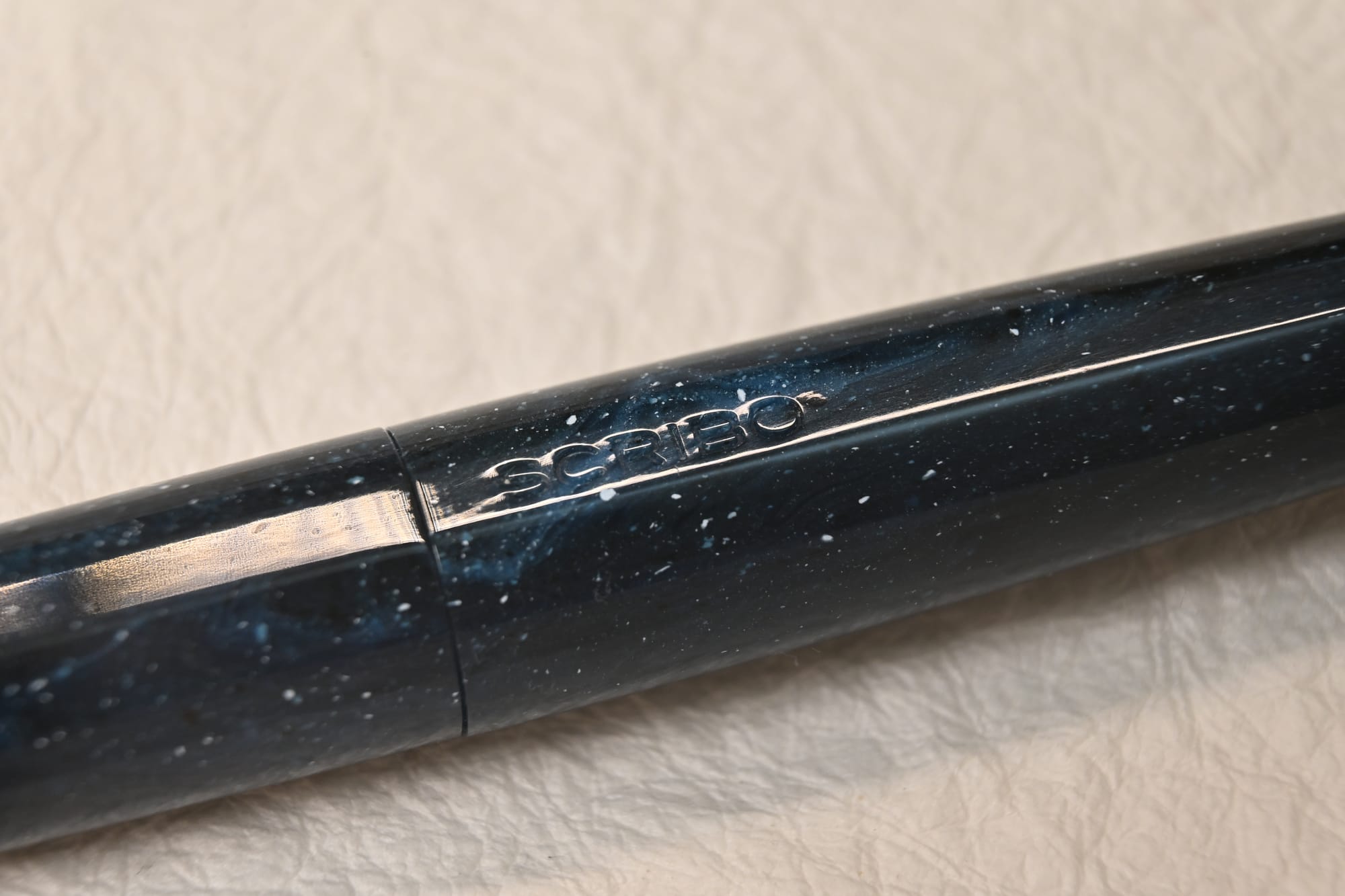
First there was the tamenuri urushi version of the Piuma, the Hane (Hane, like Piuma, means feather) — originally in brown then in green. I picked one up second hand, in the Kuro finish, which is green-black, with rhodium trim.
Then they launched a whole new model, called the Flow, which is worth a little aside...
Evolution
The first Scribo I encountered was the Write Here edition, which is a piston filler, straight-sided. It’s a good looking, classic design, but not very… sharp. All the edges have a very pronounced radius and stuff like the cap finial felt plasticky.
There’s the Piuma, which is a C/C filler, steeply tapered, with a facet down its length, and big chunky cap threads. A smaller pen, lighter.
There’s the Feel, which is faceted (12 sides), and bulbous like a zeppelin wearing a tight belt. I never liked the Feel.
There’s la Dotta, which is bulbous like the Feel, but not faceted. Better, but not quite.
Scribo hits its stride
And now in my opinion Scribo has hit a home run with the design of the Flow. It loses the bulbous silhouette of the Feel and Dotta, instead having straight walls and a slight taper to the flat ends. Instead of the 12 facets of the Feel, it has 24 mini facets, giving visual interest without disruption. Compared to the original Write Heres, everything is sharpened up. In many ways it feels like an evolution of the Scribo design language, meshing the previous models together harmoniously.
The first edition of the Flow is in rippled matte-finish ebonite, a truly distinctive material choice. I opted for the blue, which is called the Tempo.
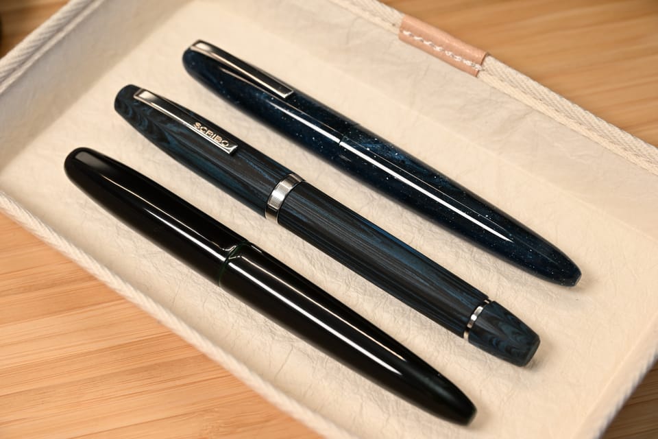
And so now I have three Scribos in my possession. What’s my take?
Let’s work backwards.
Dissecting the Flow
The Flow is a really good pen to hold and use. It is a big pen, but not as heavy as you might expect. Turning it around in your hands, the proportions are excellent. You can feel the matte ebonite, and the delicate facets, although in most lights they’re hidden both by the matte finish and the ripple lines in the ebonite.
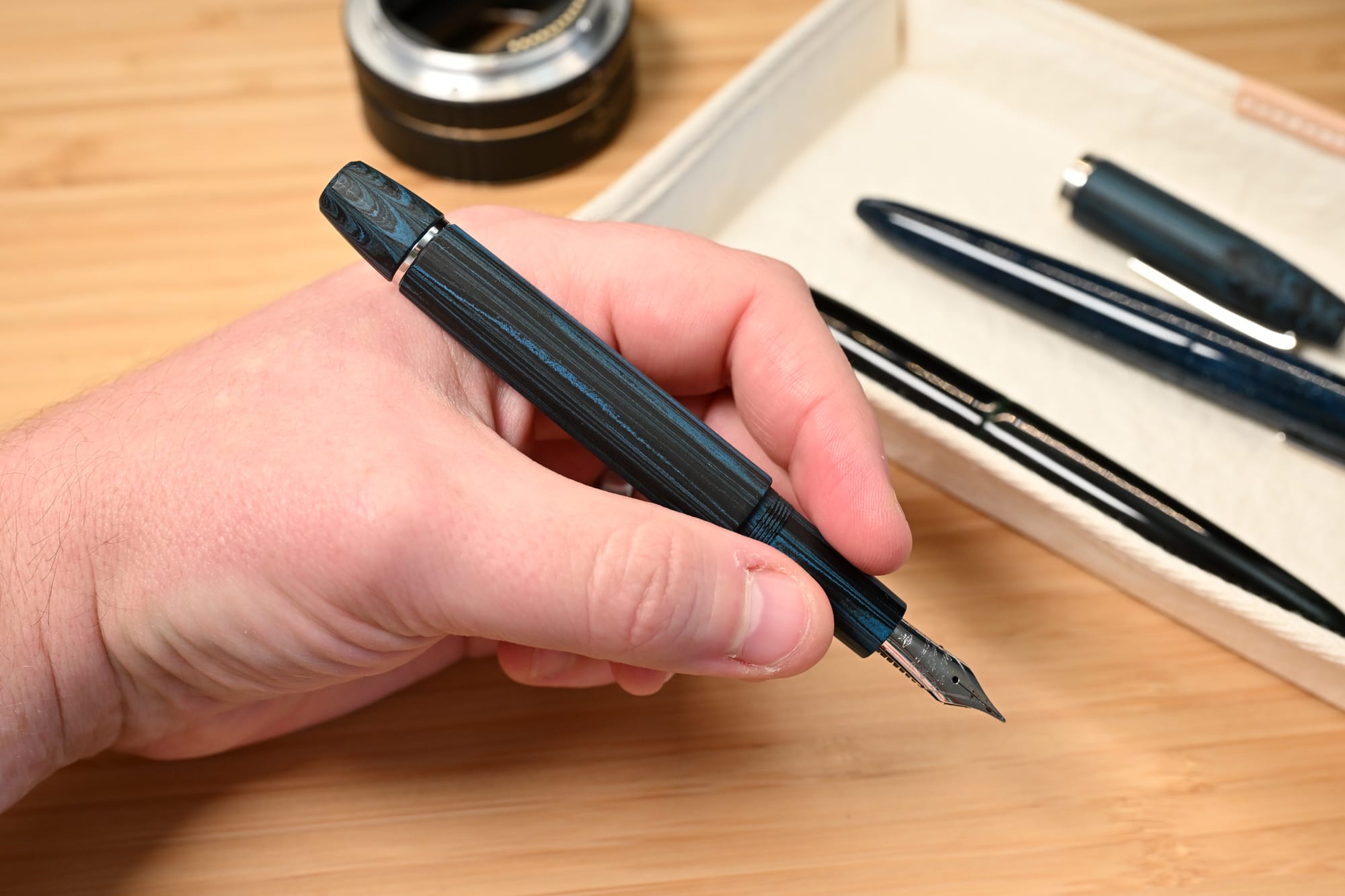
The ebonite itself is nice, a good balance of blue and black ripples. I’m not sure whether it’s Japanese Nikko, German SEM, or something else.
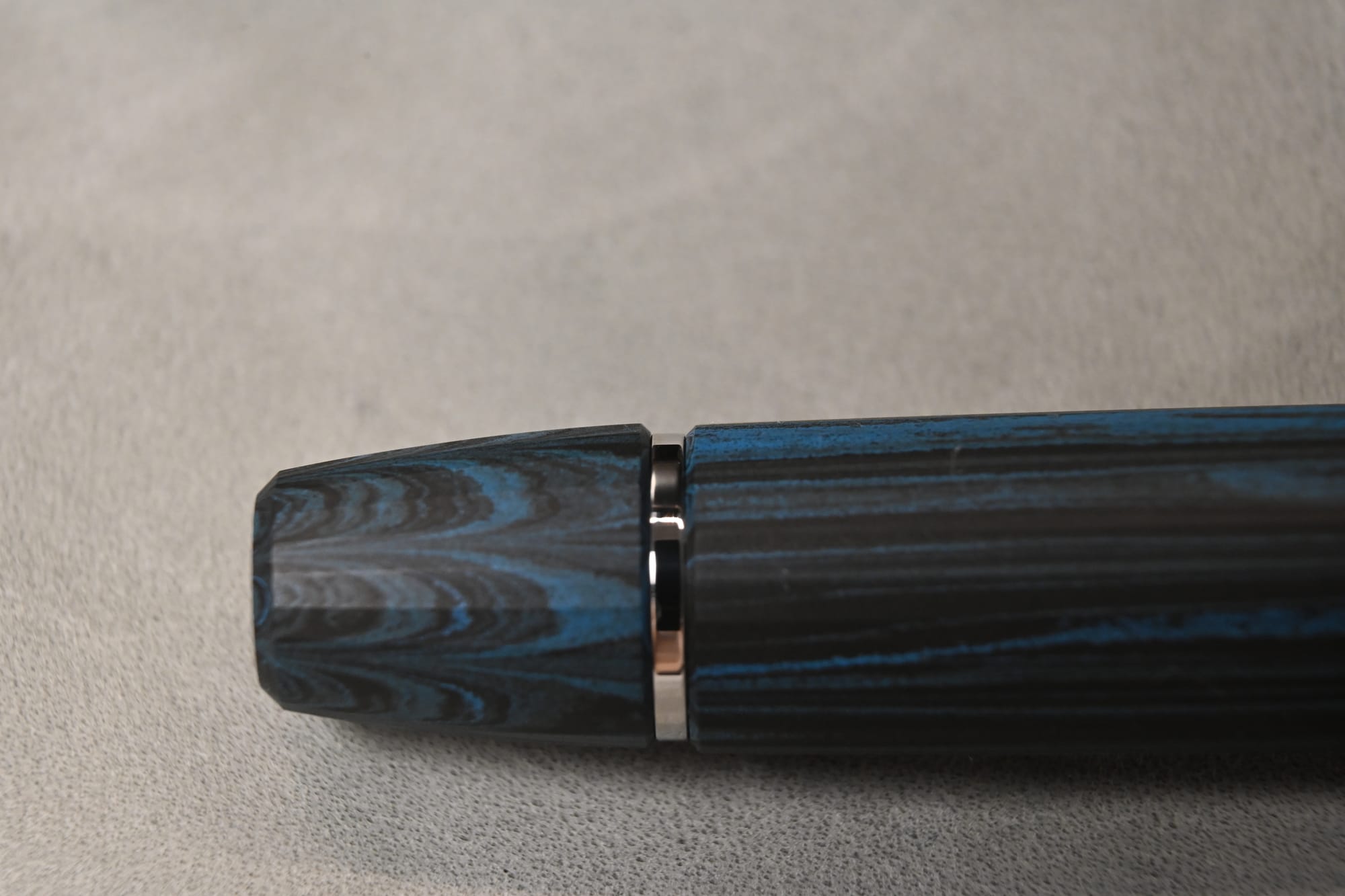
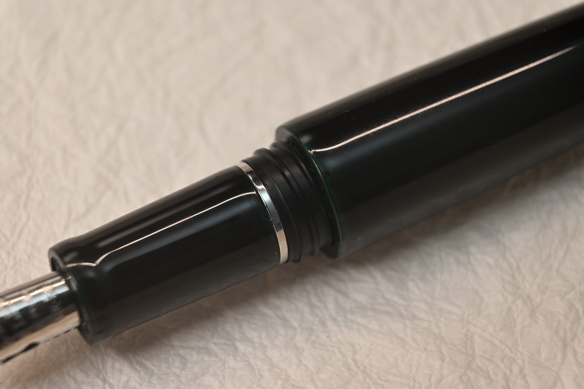
The platinum trim contrasts nicely with the ebonite: a shiny SCRIBO-branded clip, a line-engraved tapering cap band, a tiny cap finial with the Scribo feather motif, and an inset band separating the piston knob from the barrel.
It’s all about the details
This is where the little finish details start to leap out. The edges of the barrel and knob are chamfered, creating a little angled bank down to the metal band, precise without being sharp.
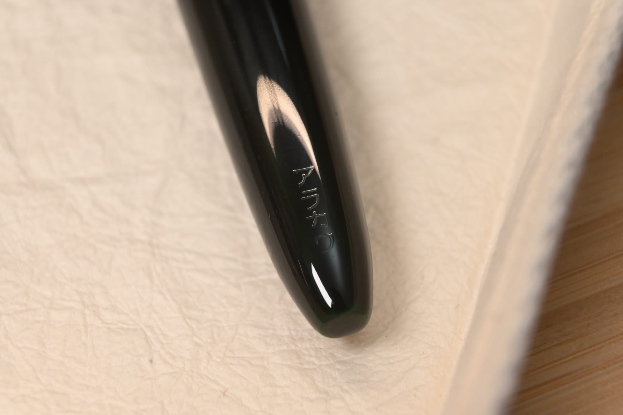
Look at the end of the piston knob and almost microscopically engraved are the words SCRIBO - ITALY.
Uncapping is in 3/4 of a turn — extremely fast. As on all Scribos except the Piuma, the cap threads are extremely flat and thin, and actually rather prone to cross-threading; the Flow seems to be even worse in this regard than I remember from previous acrylic models.
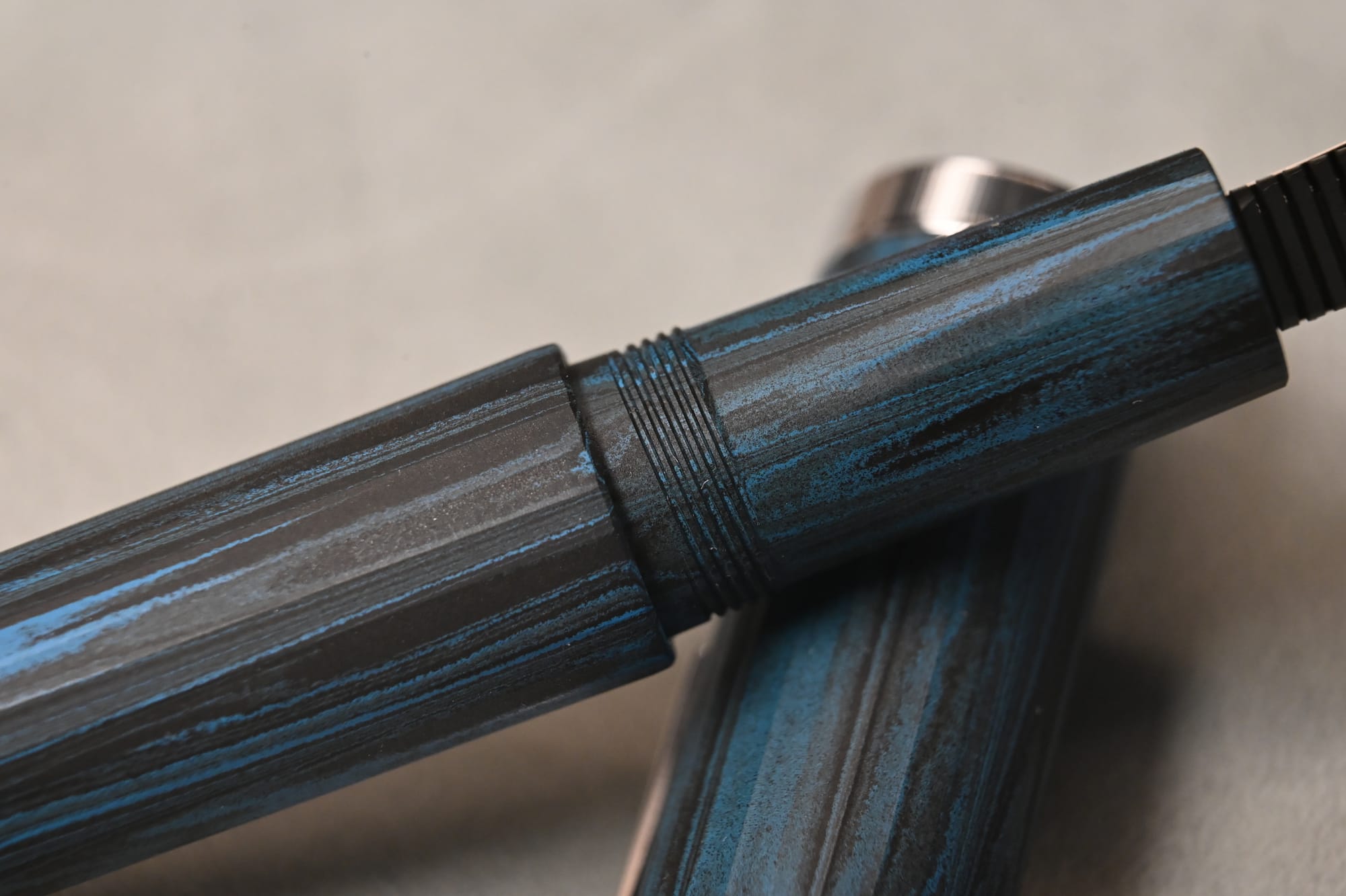
The section is very long, and slightly tapered, with no flare. Another little touch: the nib end of the section is faceted, like the cap and barrel, but these facets fade smartly away to a truly round cross section two thirds of the way up the section, allowing the cap threads to be round.
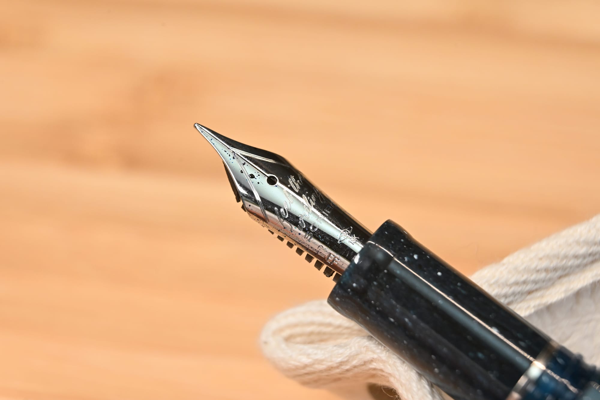
The business end
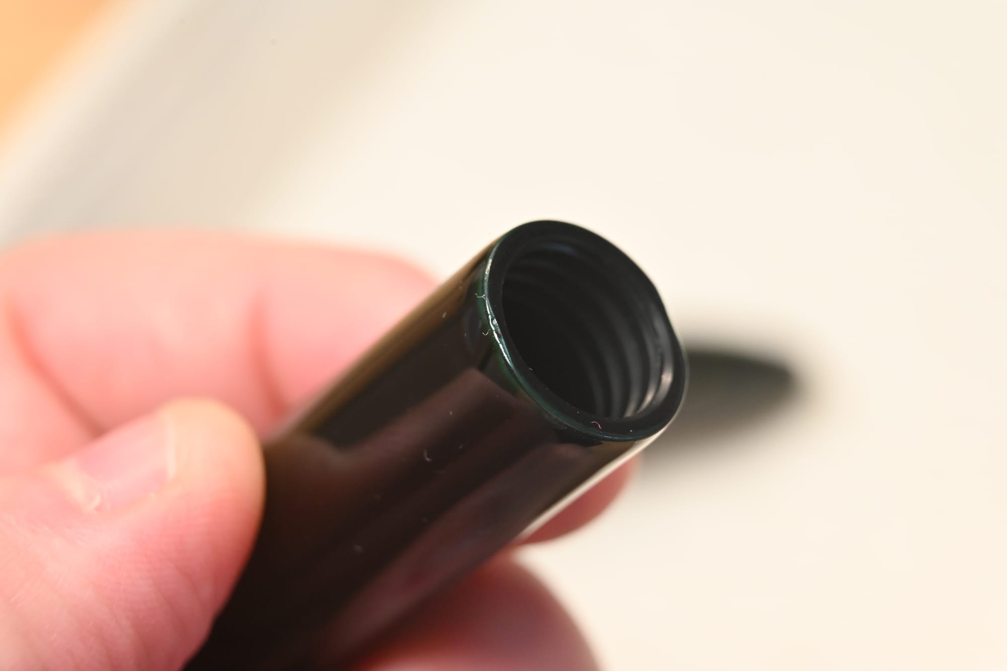
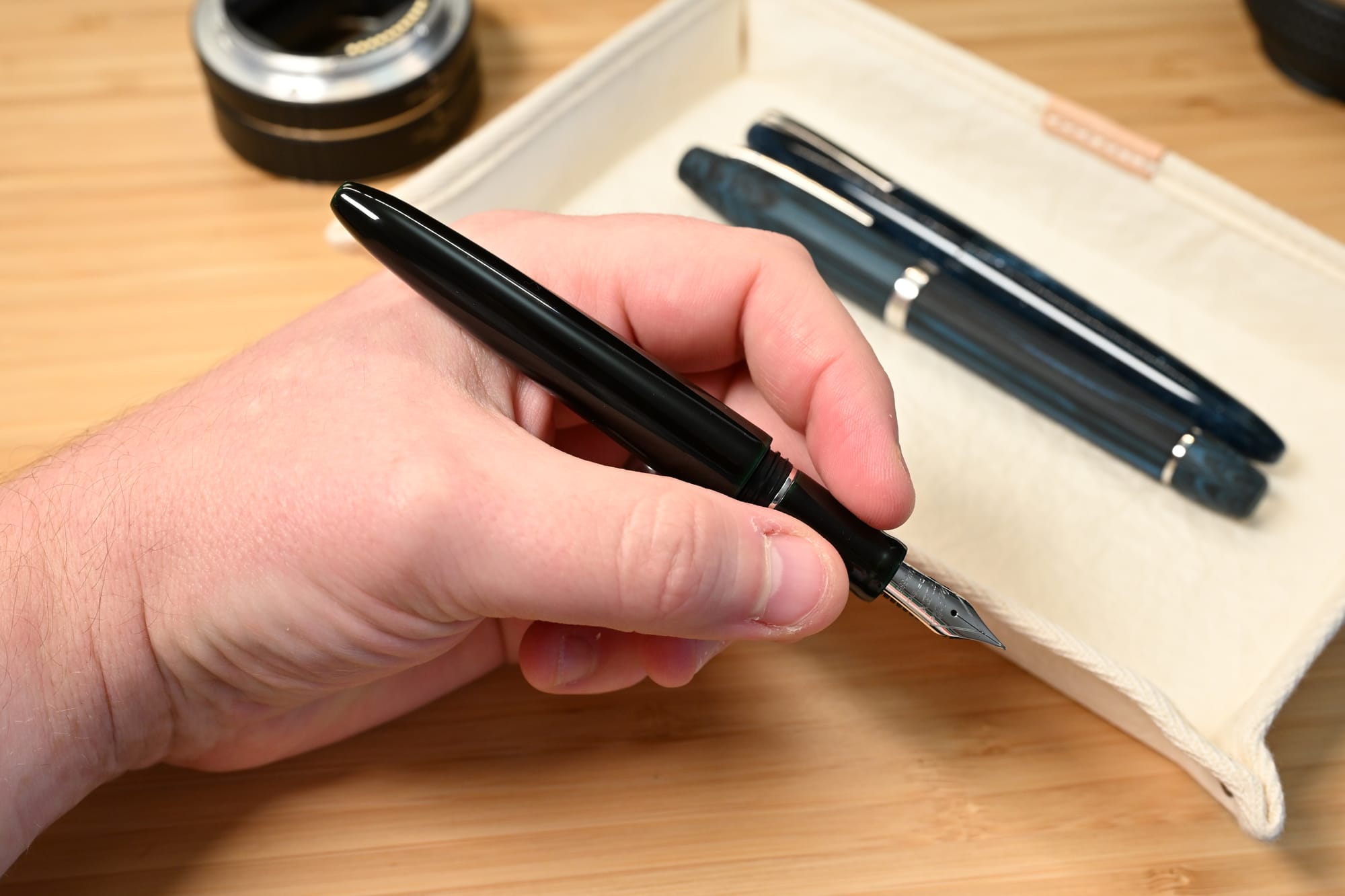
And then the business end: the nib. Mine is an 18k EF, resting on Scribo’s usual ebonite feed, and supplied by the workable piston filler. There’s no ink window.
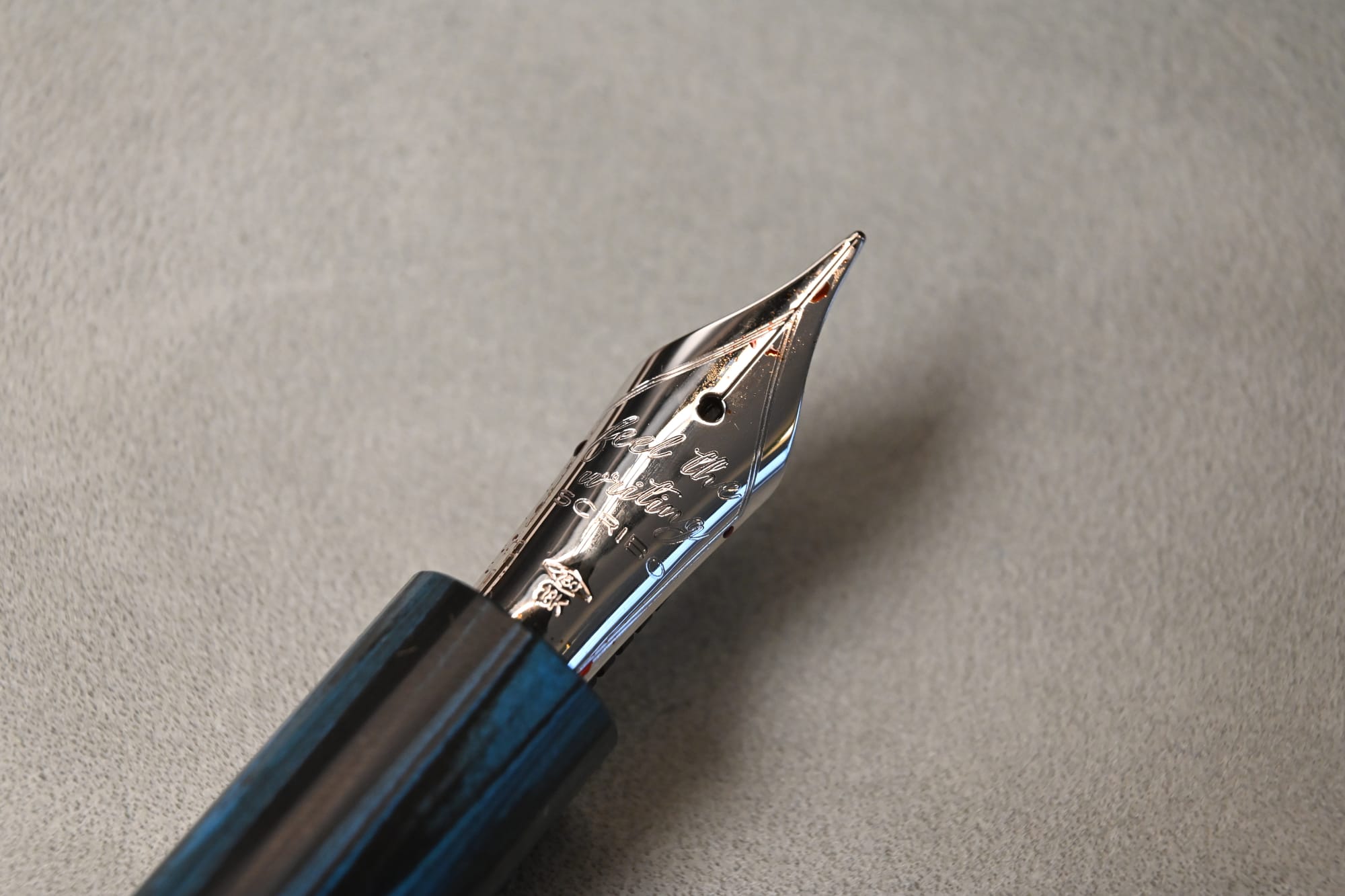
With Scribos you have an extremely wide choice of nib. 14k for flex, 18k for gentle bounce. Extra extra fine through to double broad, plus stub. This is a huge plus point and shows that Scribos are for real writers.
Personally I have found that anything wider than the EF is too wide for me, and my lefty-overwriter style doesn’t suit the 14k (more on that later).
I have had a couple of bad out-of-box experiences with Scribos over the years, but this 18k EF was one of the sweetest nibs I’ve ever used, fresh from the pack, inked with KWZ Waterloo Sunset, not even flushed first. You know how some pens just make your handwriting look good? Yeah. That. It also has delicious pencil-like feedback, which is consistent across all Scribo nibs and one of the undoubted appeals of the brand.
Weighing the value
The Flow Tempo retails in the UK for £830 or so, in a limited edition of 88. Honestly my pricing radar has gone completely in the past few years, with all pens seemingly having gained 30%+ in price.
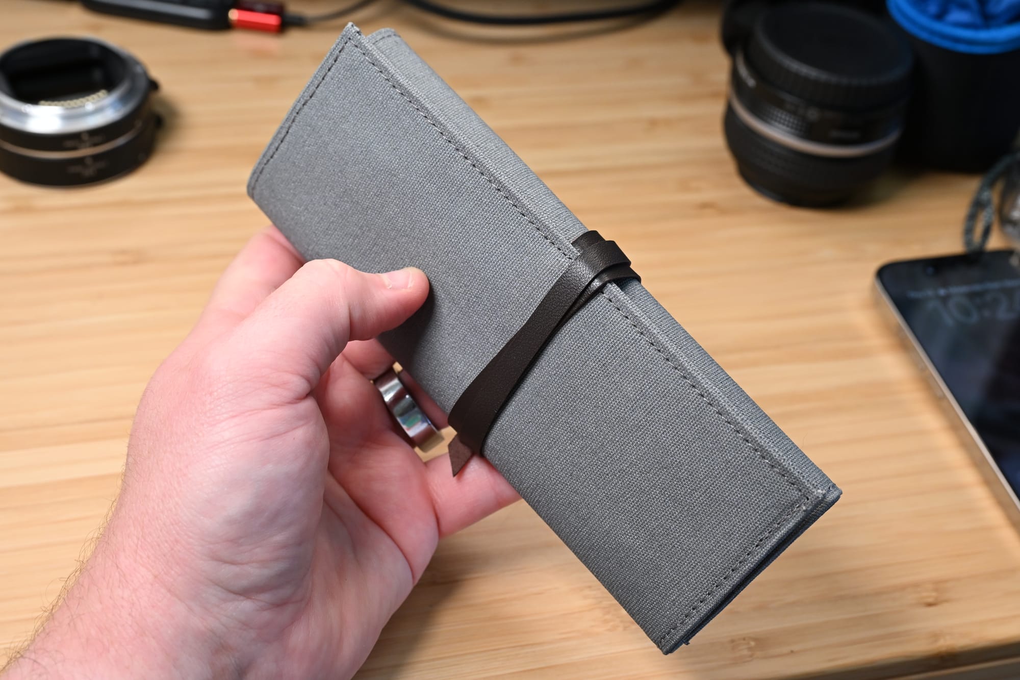
£830 feels like a lot to me, but you do get a lot for it: a very complex design, with a lot of machining; a piston filler; an in-house nib and ebonite feed; and an unusual material. What you don’t get is a ton of packaging or extras: Scribos come in a neat little two-pen fabric wrap with a cleaning cloth, in a cardboard box, no ink bottle or anything.
Now on to the Piuma Hane Kuro.
Familiar, but different
In many ways, this is a much more familiar pen, since it’s my third Piuma. It’s a no-nonsense CC filler, and mine has the 14k flex nib in F, which as I knew when I bought it, is in my hand an uncontrollable bouncy mess that lays down a wet and wide line.
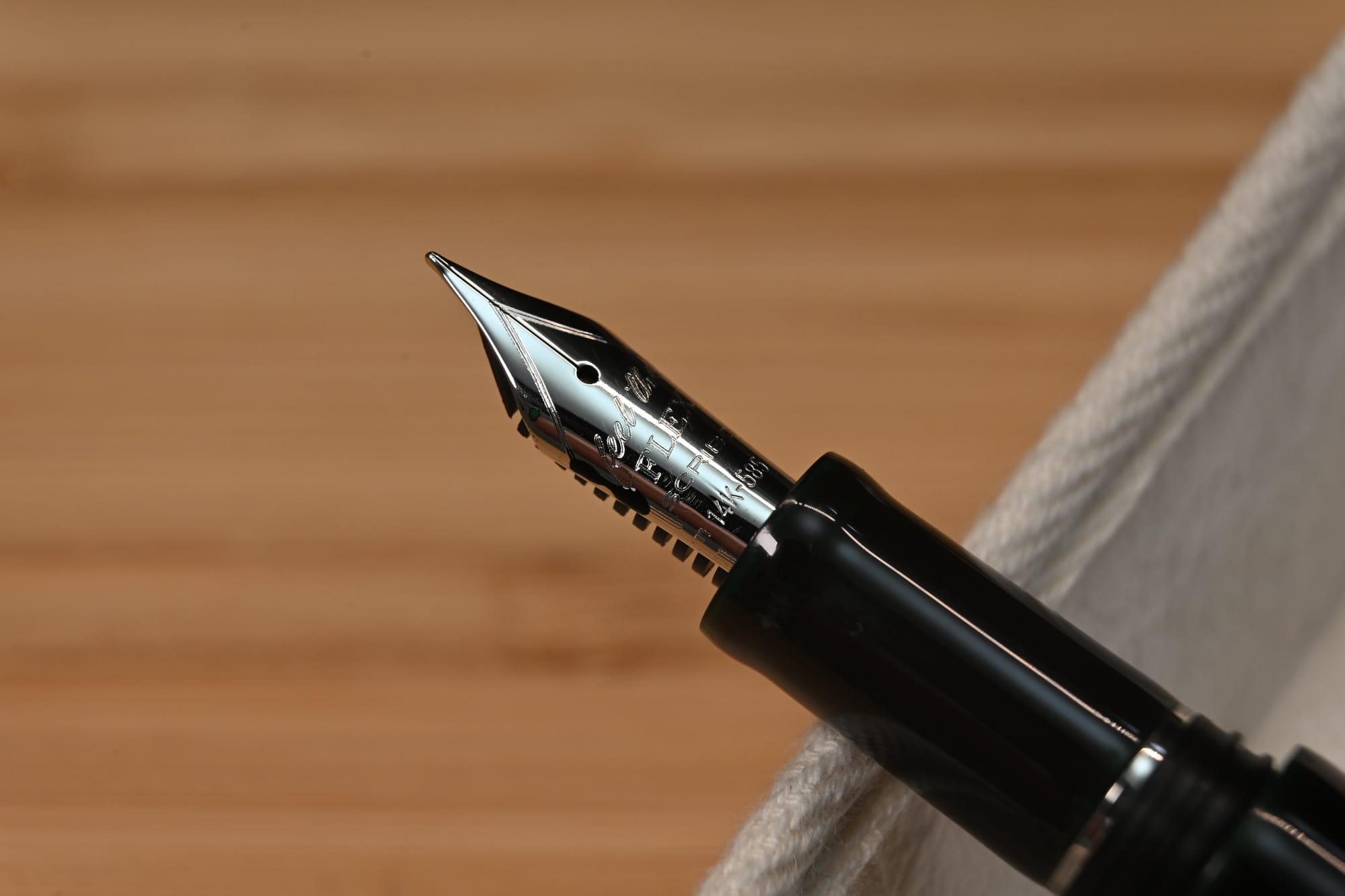
I was curious to see how Scribo would handle the urushi on this pen: after all, the Piuma has faceted sides that need to line up, and it has huge acme cap threads that are very visible right in the middle of the design.
Indeed, Scribo has left these threads uncoated with urushi (most makers do this, to be fair), and they run smoothly, leaving the facets pretty well aligned. I will say that the layers of urushi mean the facets are much less well defined than on the normal Piuma.
Stripped back to the essentials (with a few nice touches)
There are a couple of other noticeable differences from the base Piuma. For a start, there’s no clip or cap finial: the only trim on the pen is a thin metal ring, visible when you uncap, separating the section from the threads.
There’s also two sets of katakana characters on the barrel, on opposite sides, barely visible in dark green on the near-black body. One is the signature of the urushi artist; the other says Scribo.
Nitpicking the craft
So what about that urushi? Well, I am no expert. It is smooth, even, and seems well done. Mine has a few tiny chips around where the cap and barrel meet, visible through a loupe, which seem to be manufacturing defects (I am sure they were not caused by the original owner, who I know well). The flat, facing edge of the barrel step is a little messy.
Being honest, compared to Nakaya, Namiki, Danitrio and Tohma, this urushi seems a little more rustic. But compared to some of the smaller makers I have seen around at shows (naming no names), it’s very nicely done indeed.
Shining a light on colour
The dark green, which should be more visible over time, currently only really comes out around the cap/barrel join. In dim, interior evening lighting, it’s a coniferous, almost blue green, rising to the luminous colour of mint choc chip ice cream under bright light — which also brings out the brown along the barrel, particularly on the facets.
Unlike the usual Scribo pouch, the Hane comes in a kimono fabric pouch, which is a nice touch and supports the storytelling that Scribo has built up around this model.
At a list price of 938 euros, this is a pretty expensive Scribo (although the gorgeous new Onsen is pushing that up to the 1300+ euros mark). Urushi has an undeniable labour and material cost to it, so I certainly don’t begrudge the price point.
Three, two, one
So.
A beautiful faceted flagship, and a little jewel of urushi craft. Both are really nice pens and elevate the brand that bit more from its starting point of being all about the nib.
The urushi Piuma should be the one that grabs me the most — the majority of my collection now is Japanese, and nearly half of it is urushi.
But actually, of the two new arrivals, it’s the Flow that really impresses. It has a quality of fit and finish that I haven’t seen on Scribos before, and the nib is a gem. If it didn’t have slightly problematic threads, I would call it close to perfect.
The crazy thing is, the Scribo I like most is the goddamn Piuma a Riveder la Stelle that I started with. I like the nib best, and despite it being just plastic, I like the starlike resin more than the green urushi or blue ripple ebonite. Never mind that it’s a basic C/C that retails hundreds of euros less than these two.
This is the insanity of collecting and using fountain pens. Buy a pen you like, go down a rabbit hole, spend £1500 on two more pens, end up back where you started.
Member discussion