State of the collection, October 2025: Part 1
I said this wasn’t a pen blog… but pens are very much on my mind at the moment. I spent this last Saturday at the London Pen Show, and as always my brain has been spinning non-stop for weeks: writing wishlists, looking at table plans, and compulsively refreshing social media.
The reality is that I 100%, absolutely, definitely never need to buy another fountain pen in my entire goddamn life.
My current collection (or gathering, accumulation, toolbox, whatever you want to call it) is full of Deliberate Objects, pens that are either straight-up iconic, or so purposefully designed that they merit thoughtful appreciation.
Here’s the tour.
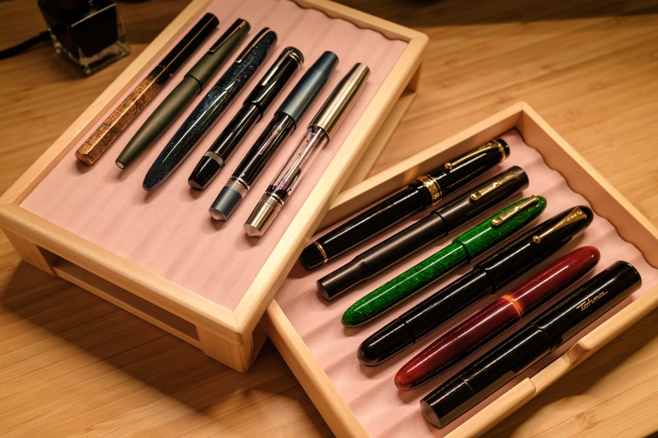
Right now, I have twelve pens on duty, plus one pocket pen. They’re stored in this lovely, brand new Toyooka chest, sat in the corner of my desk where I spend far too much time.
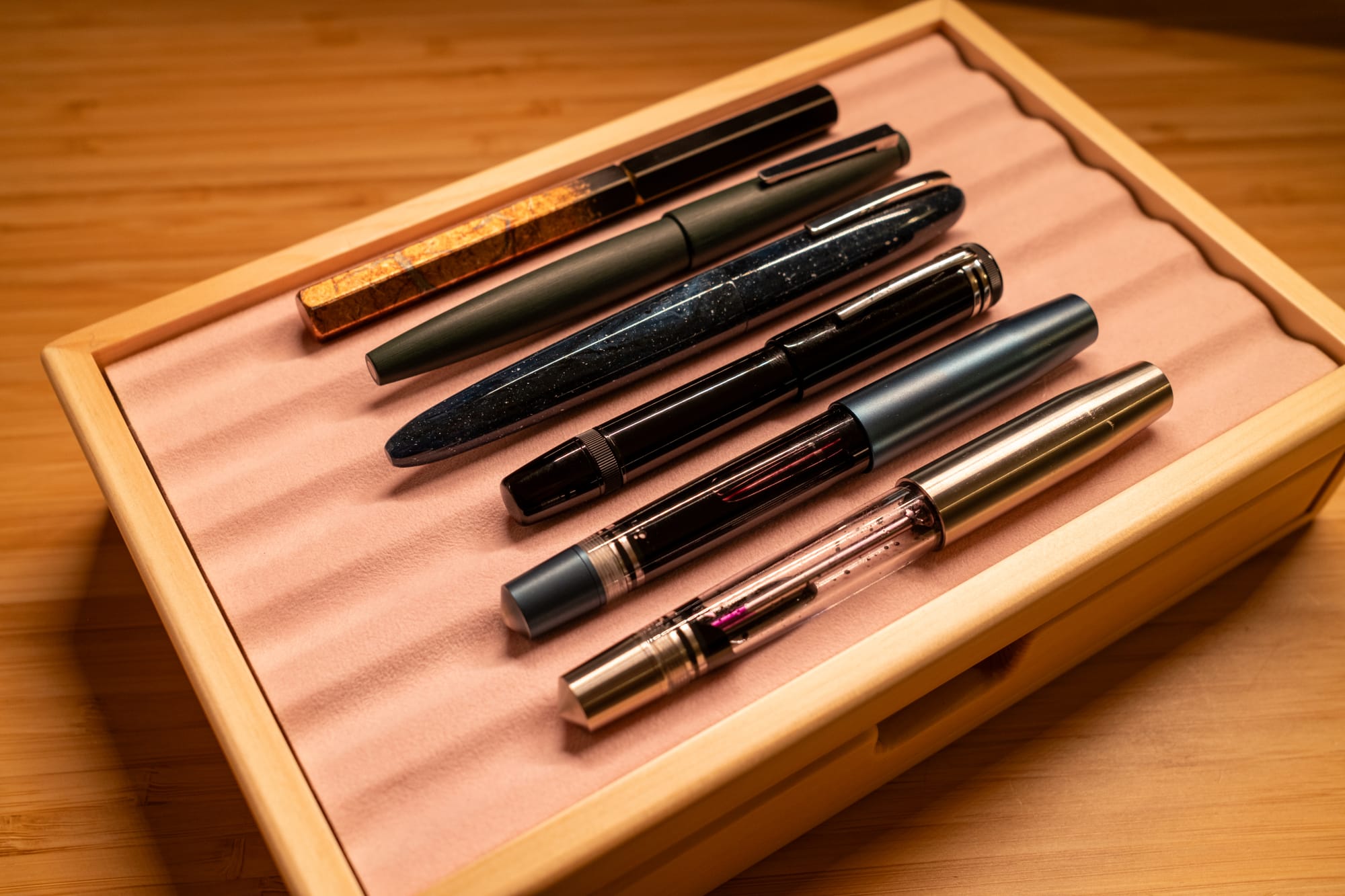
On the top row, I have, well, smaller pens: ones that are more tool-like in their ethos. And that’s what I’m going to lead you through in this post.
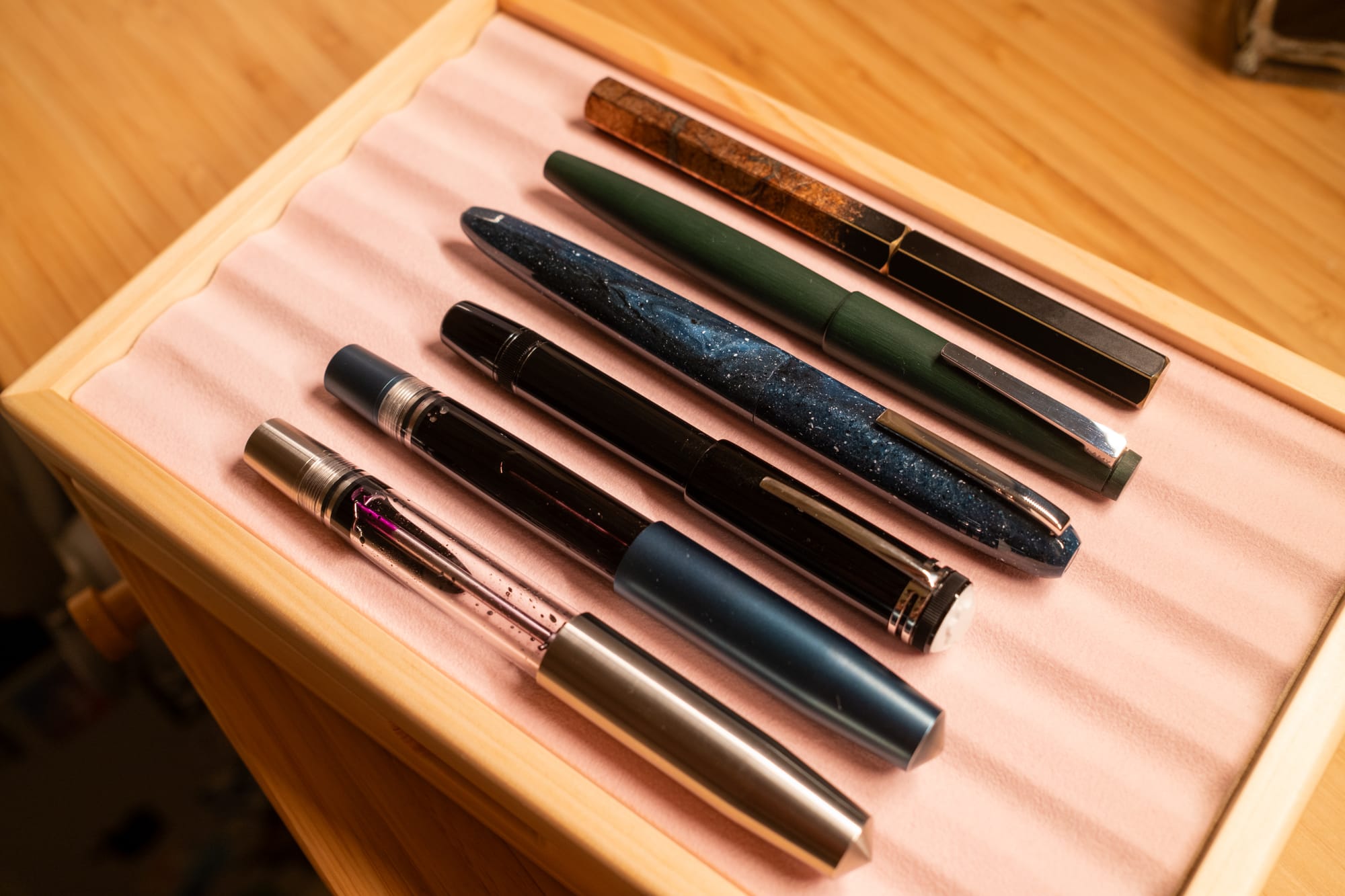
Starting at the front, two Kakaris, one Gravitas-issued, one from Kyuseido, and both fitted with Kyuseido needlepoint nibs.
I could make a strong case for the Kakari being my favourite pen, despite it objectively not being the ‘best’. I don’t mean that to damn with faint praise: the Kakari is excellent. It has a version of the bulkfiller mechanism, so it holds a ton of ink. It dismantles fully, for easy cleaning, yet is packed with o-rings. The delrin-lined cap spins off quickly and seals totally, so there’s no risk of ink drying out. It’s a demonstrator, so you can see how much ink you have left. The section is a good size, well shaped and comfortable to hold. And it’s well proportioned. It just looks ‘right’.
What I love about the Kakari is that it’s so easy to live with, and also that it’s a fucking killer note-taker. The quick cap and agile size mean I just don’t THINK about it when I’m using it — I just write. And the needlepoint nibs from CY are outstanding, as well as having a beautiful nib imprint.
Next up: the Montblanc 1912. I first reviewed this pen back in 2018, sold it a few years ago, and bought another one recently (for way more than I sold it for). Everything I wrote back in 2018 is true in my heart today. This is a stupid pen, but also there’s something very special about it. It sits like a compact, heavy talisman in your pocket. The sectionless design feels great in the hand. And the mechanism is like a little piece of magic, revealing that tiny, springy nib with a flourish. Great stuff.
I reviewed the Scribo Piuma some years ago too, and was hot and cold on it. The design at the time felt clunky to me, with a gargantuan barrel step, Duplo-style threads and a contrived facet that couldn’t distract from the nib that would not write. And then a few months ago I saw this one in the pretty “a riveder le stelle” resin, which does indeed look like stars. It has the 18k EF nib, which is wet and pencil-toothy, and somehow feels longer than it is. I just love writing with it, and despite it being a bog-standard plastic converter thing it just has spirit. For Scribo, their soul is in the nib, the source of their proud history. And I can feel it.
The Lamy 2000 has been one of my favourites for a decade, and even now if you give me half a chance, I’ll recommend it to you, and wax lyrical about the iconic German design. I still admire it a great deal, here in this limited edition Pine Green. For my money, no other pen has this perfectly cohesive design or combination of features: the seamless piston filler, articulated clip, just-so slip cap, ink window, and that gorgeous hooded nib. The truth is, I don’t use the 2000 much, and as the years have gone on, it feels smaller to me. But I can’t bring myself to be without one. It has been DESIGNED, and the result is both functional and aesthetic.
And finally, for this post at least, the Ystudio Portable Renaissance Yakihaku. I owned a copper Ystudio Portable some years ago, and enjoyed the way it felt like a worn pebble, the broad facets softening with use, the material patinating, the click of the cap like a fidget toy. This is a pen built to wabi-sabi with you as you move through your life.
Eventually I sold it — maybe the little steel nib was too boring, maybe it dried out too fast, maybe it was too slim — but I kept an eye on Ystudio, and then this beast appeared. The Yakihaku edition is an artisan creation, painstaking layered foil creating a storm of gold, copper and silver effects. It’s very pretty, and something I have never seen on another pen.
So I bought it. The nib sucked; a boring number 5 that was 14k gold for no reason at all. My good friend Jose from NibLab made it a nice architect, but last night I had an inspiration to swap in a characterful, glorious 14k nib from a Geha that I had floating around. It’s a match made in heaven.
For me, these pens all have that special something: the engineering of the Kakaris, the magic trick of the 1912, the nib of the Scribo, the timeless design of the 2000, and the tactile craft of the Ystudio. They are all, for sure, Deliberate Objects.
Part two coming soon.
Member discussion